Wednesday, March 20, 2024
Rails Guides get a facelift
Posted by Rails Foundation
When Rails 7.0 landed in December 2021, it came with a fresh new homepage and a new boot screen. The design of the guides, however, has remained largely untouched since 2009 - a point which hasn’t gone unnoticed (we heard your feedback).
With all of the work right now going into removing complexity from the Rails framework and making the documentation consistent, clear, and up-to-date, it was time to tackle the design of the guides and make them equally modern, simple, and fresh.
We worked with UX designer John Athayde to take the look and feel of the homepage and transfer that over to the Rails Guide to make it clean, sleek, and up-to-date.
The layout will remain the same, but from today you will see the following changes reflected in the Edge Guides:
- Cleaner, less busy design.
- Fonts, color scheme, and logo more consistent with the home page.
- Updated iconography.
- Simplified navigation.
- Sticky ‘Chapter’ navbar when scrolling.
Before & After
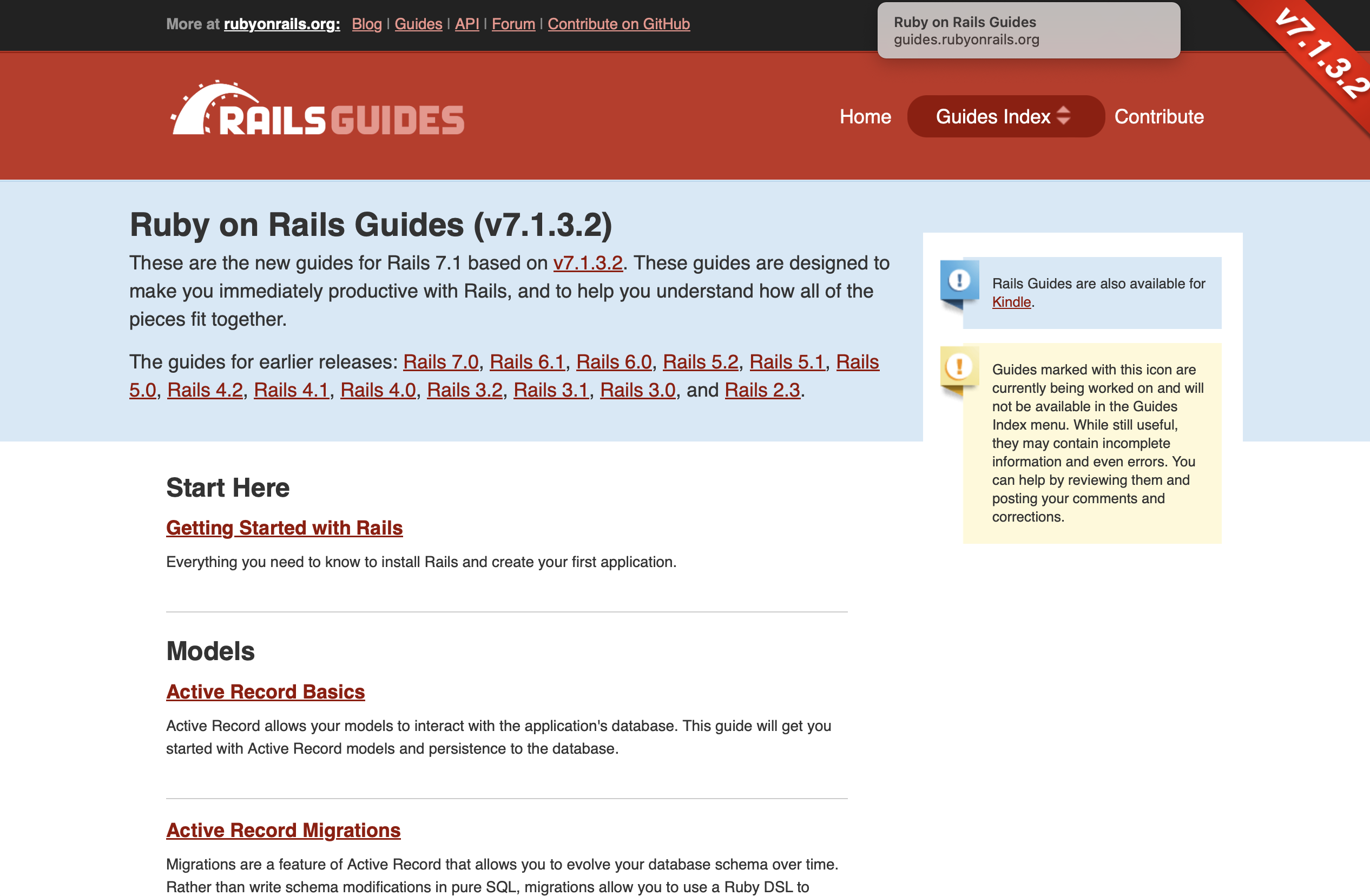
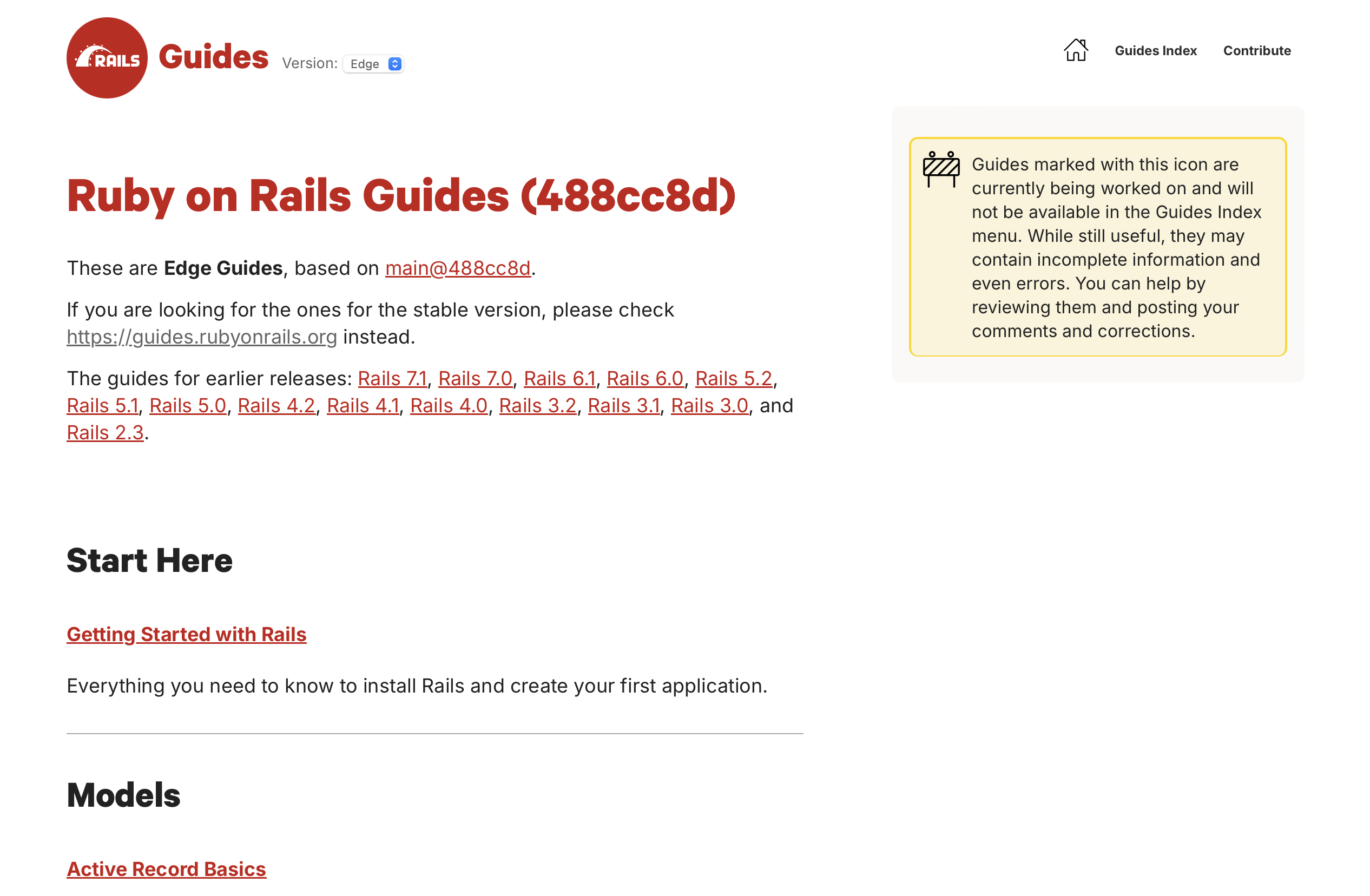
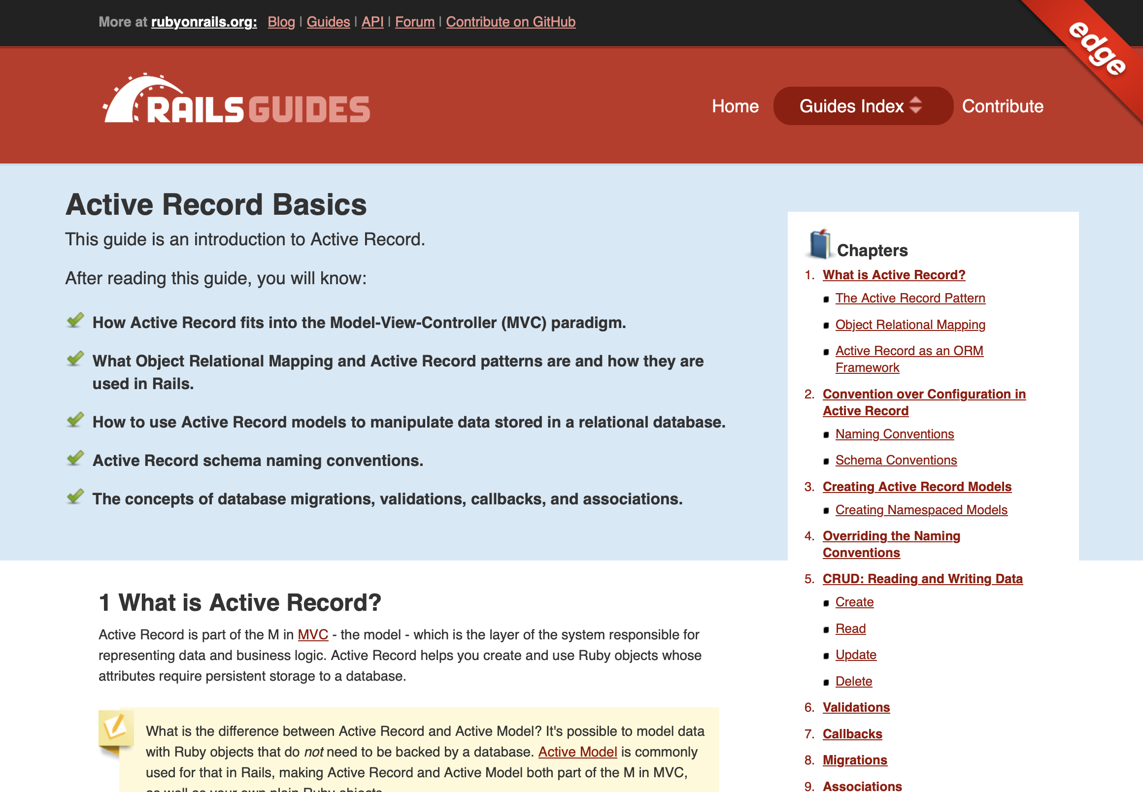
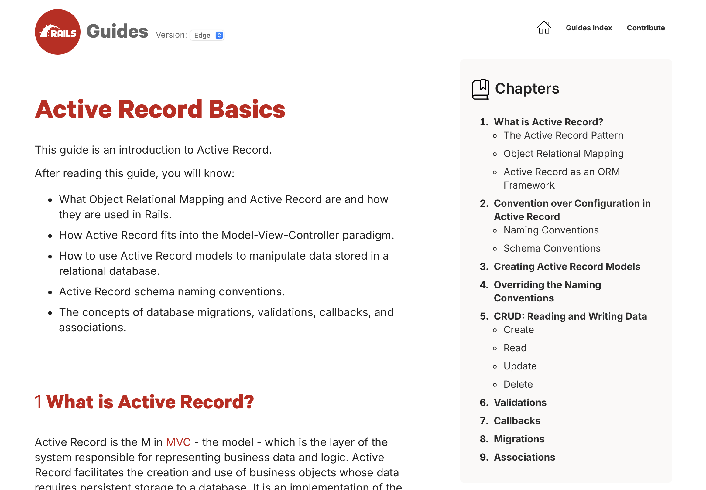
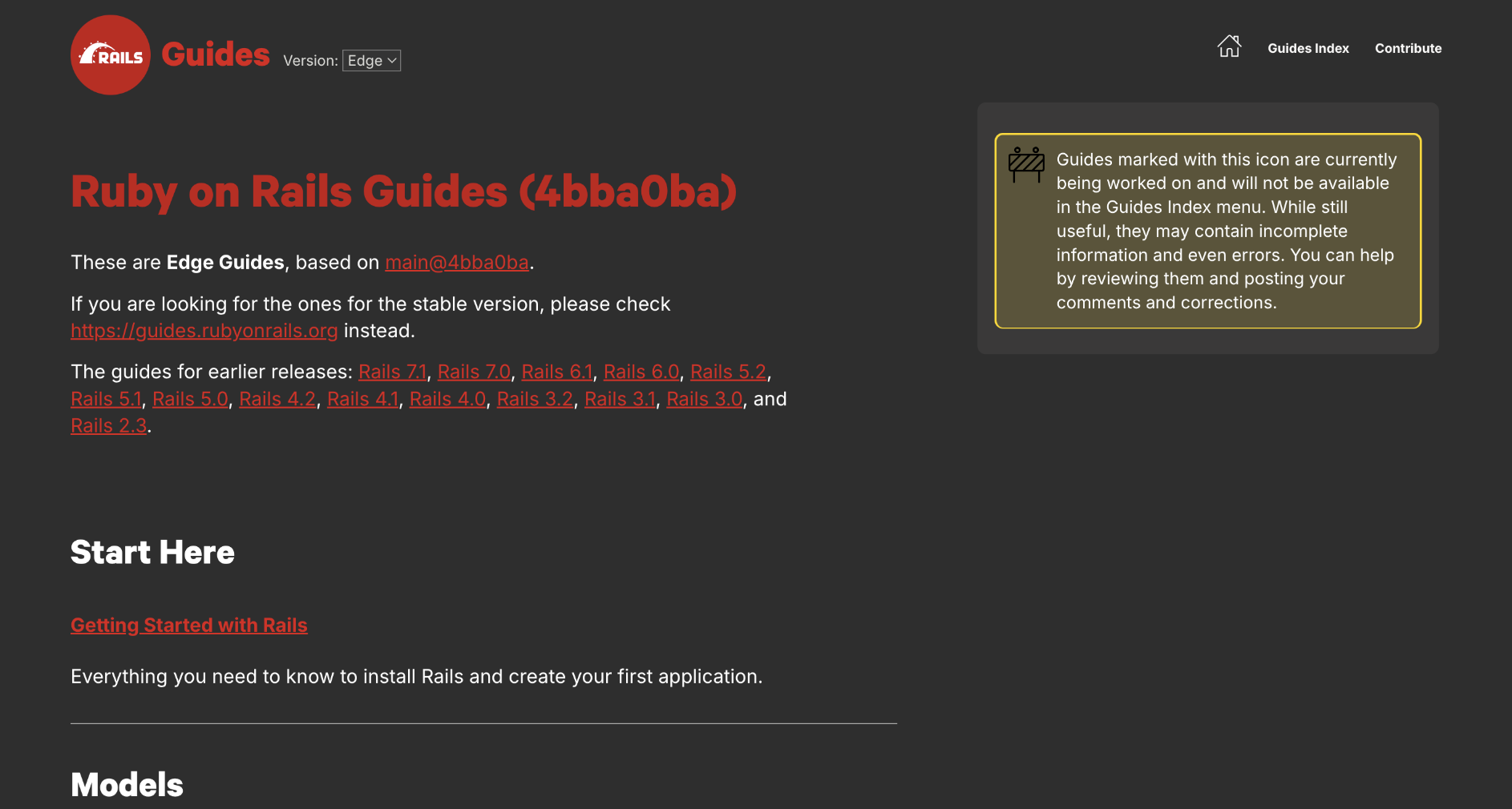
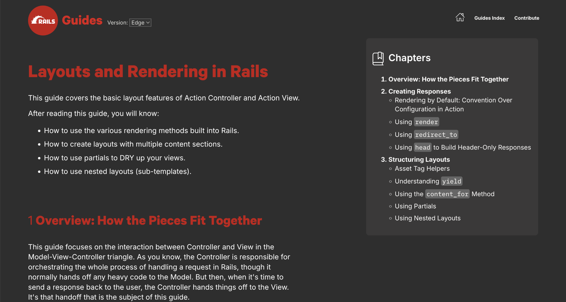
For now, this refresh is still a work in progress, so it is only reflected in the Edge Guides while we make the final adjustments. Once we are happy with it, we will update the guides for stable Rails 7 versions. This design will then render for all new guides from the next release onwards.
Feedback
If you find a bug or wish to submit a suggestion*, please open a discussion on GitHub, and feel free to tag Amanda for visibility.
Hope you like the changes, and we look forward to your feedback!
(* A search bar has already been suggested and we will look into options with the Core team.)